Anastasiy Safari

Decor: Elements of Emotion

Posted by Anastasiy Safari on Saturday Nov 22, 2008 Under Agent's bias, Galleries, Images, Subliminal, Decorating, Выставки

If you think we’re disappeared – that’s not true. We were in a rush preparing the new show. So…

ILYa GotFRYd presents Anastasiy Safari Fine Art Photography show.
Decor: Elements of Emotion
In the spirit of modern times Safari brings you uplifting decorative show . On Nov 29th at 5:00PM you will have an opportunity to brighten your day. Open your mind to the possibilities and your wallets for a chance to win one
of the artworks on display. Wine and cheese reception will feature raffle with the chance to win an artwork of your choice. We are looking forward to seeing you in Cleveland, OH, USA at Lake Erie Artist Gallery in Tower City. The Opening is Nov 29 @ 5:00 pm.

We’re also celebrating this day the birthday of our distinguished friend and art agent (as well as our main blog author). Don’t miss the opportunity to meet him in person and let him take you away into the aerial world of art with his unquenchable energy flux and friendliness.

Happy birthday, Ilya!

Remember to park and ride to protect the environment and save on parking.
http://www.gcrta.org/ro_park.asp


| 14 comments
Ilya Gotfryd

Agent’s perspective: pricing your works.

Posted by Ilya Gotfryd on Thursday Oct 16, 2008 Under Agent's bias, Galleries, Letters

This is a spur of the moment writing that resulted from a comment in a previous post. From my experience there are several criteria dictating the price of an initial sale that I can tell you about right off the bet.

Step one. A relatively quick research of the local artists can tell you what to start with. You can, pick an existing photographer, print and frame your images to be of the same quality as his and put up a price close to his. This implies several things: you are showing to the crowd that he is showing to, your works strike you as similar in quality (craftsmanship), your image measurements and your framing are truly adequate or surpass those of his, he is actually a selling artist.

Next one would be pricing from experience. There are tones of art fares and shows held through out States. Pitch a tent in one, set up shop, look around at the prices of others and set yours. Have sets of large original prints at respectable price and put together a bin of knock-offs(mat only, 1/4 of the original, price accordingly). Play with the price in the small bin and see when people will buy. Try 4X the prices on the large works. Also if a person is interested in a small image try to sell her a large version of one.

Third approach is a gallery set price. It is good to show your works as much as possible, however you can tell experienced gallery curator if they can price your work for you. The reasons they can are as follows: they advertise regularly and know the abilities of their clientele, they have a reputation to uphold so the price has to be with in range, they have a general sense of which works would be more attractive to a client. If you have been selected by such a gallery you have a solid price for your works.

Another good criteria is a first sell. If you have sold a work of certain size and certain packaging for a certain price you have a good standard to measure against. In fact if going forward you become better known and the prices of your initial sales go up it will imply that the prices of your earlier works are now higher. This is where art as an investment comes in.

On the note of setting a good price for your works, there is a noble way to go about it. Either donate your work to a charitable auction or as a charity to sponsor your work and donate proceedings to that charity. Some artists would even put a plexiglass bin and have people throw in recipts for a fraction of the artwrok’s cost with an opportunity to win it and proceedings going towards a charity of artist’s choice. In this instance you get publicity, a price for your works and a good feeling that your works really ment soething for a number of people. The only true risk in this instance is to end up with a low price for your work or an unsold work due to a price that is too high for an auction. That is however something you would have to gamble with.

There are dangerous pitfalls to worry about. A price attached to an artwork can have a direct effect on people’s perception of it. If you price an artwork as one of our readers suggested (cost of materials and assembly labour + a little bit for artists daily expanses) you are running a risk of ruining your true worth and your image. Humans tend to attach emotions to money, so if you try to appease their financial abilities you are running a risk of turning your work of Fine Art into another addition to their decor.

Looking forward to being flamed for the last paragraph,

ILYa


| 19 comments
Ilya Gotfryd

Agent’s Bias: buying art (sex appeal)

Posted by Ilya Gotfryd on Tuesday Oct 7, 2008 Under Agent's bias, Images, Subliminal

In this installment of “buying art” I am looking at a very basic attraction to a work of art. I am performing a dissection in attempt to analyze this particular force in visual art acquisition. While enjoying a work of art from the “sex appeal” category you might point out a great choice of color, an originality of a pose or a facial expression. There will always be polite remarks about some sort of details in the remaining background or wonderful details in the shading of the draping cloth. Some of you would be as honest as to state that an image is risque. I guess only the last admission will actually describe the basic reason for an attraction – it is after all sex appeal. An artwork can make it acceptable to have a nude in plain sight without raising questions of impropriety.

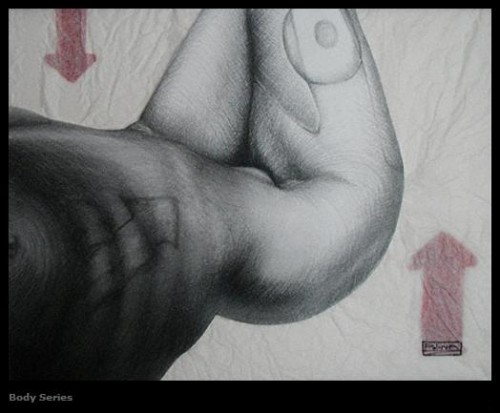
Polina Zaitseva – Body Series
Polina Zaitseva – Body Series ©, 2008

To the left we see a prime example of “sex appeal”. An exposed curve of human body catches your eye. This image carries very simple significance, it’s sexy. It does help greatly that the image is a worth while composition with an attractive character. That the fleeting moment looks so precious and that the framing of the image makes it look almost voyeuristic. It is filled with textured media and symbols of hidden significance. In a way the symbols might even give you a sensation that this is a start up guide. The kind of paper with few basic instructions that comes with your newly acquired gadget. Oh, the implications of these arrows – handle with care, this side up. This work takes you right to the destination of its purpose – sex appeal.

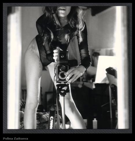
Polina Zaitseva – Closet
Polina Zaitseva – Closet ©, 2008

This next work has a flavor of exhibitionism to it. The darkness in it is of “the secrets of the high society” flavor rather then a touch of goth. The choice of camera included in the shot and the cloth of the characters garment add to the certain lighting quality of classy gentleman’s magazine pages. A mix of vintage in the soft tones of the room disappearing in the depth of field and the sharp modern look of the synthetic clothes and subject’s physique. Yet the basics of the shot remain the same, it is after all sex appeal.

There is however much more to the sex appeal then forms, textures and skin tones. It can go much deeper then cloth covering the nude body and the bone, muscles and fat tissue that that shapes it. A lot of sex appeal can be drawn from subtleties of chracter’s actions. Throw in the surrounding atmosphere and you can read a lot from an artwork at times without even knowing it.

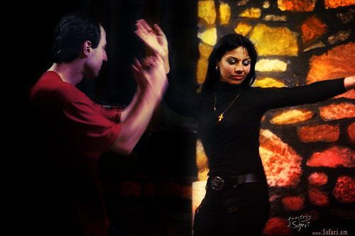
Anastasiy Safari – Armenia Series

It is interesting that the following image is made by the man on the left just as much as it is made by the woman to the center right. By the look of the eclectic surroundings he is not dressed for the occasion. The variable redness of his skin however indicates that he is actively partaking in the festivities. Yes he is mildly intoxicated, by the wine and the atmosphere. You can see it in the eagerness of his clapping as well. He is, however so mesmerized by the woman in front of him his entire head and neck is perfectly still and turned towards her. Moving on to the centerpiece; You can read so much drama in her that you would have hard time finding a place to start the description. We can tell that she is dancing for him, because her shoulders and even hips are clearly turned towards him, however the movement of the hands and the turn of the head try to hide these signs in the pattern of the dance. The mixed smile could be compared in complexity even to Giaconda. It has desire for happiness and signs of uncertainty and possibly even a hint of disappointment in these reoccurring feelings. This mix of emotions, desires and disappointment touches observer through paths other then logic. These signs of action short circuit the brain and take you right to the core sensation of sex appeal.

ILYa.


| 26 comments
Ilya Gotfryd

Agent’s Bias: buying art (hometown bias)

Posted by Ilya Gotfryd on Tuesday Sep 16, 2008 Under Agent's bias, Images

Buying for the sake of location.

We are continuing our exploration on buying art. A number of artworks be it stitching, water colors or photography is exchanged for “all-accepted” little green works of art due to their hometown apeal. Pardon my description, but dollars are exquisite works of mass produced art. Coming back to the hometown appeal. An artwork could be well framed mediocre shot of a well known local high-rise that symbolises a city of one kind or the other. If the city is admired by many you can find that image successfully sold in a local gift shop. Otherwise it is a purview of locals that would not live their town even in a case of a nuclear strike.

A somewhat sad reality of this artwork is that it is often a mediocre depiction that is valued more for it’s symbolism then for it’s artistic quality. If the artwork is made by a local artist this landmark had become such an eyesore for him that he had possibly lost all fresh perspective. If it is a well known location then all pervasive precooked images have often poisoned any possibility of a fresh look by a visiting artist. 

Shown here is a relatively common look at Cleveland, OH. Showing big city lights, its sea port features. This image is relatively common show of landmarks and skyline. There is an impressive line up of images on the web as well as a line up available for sale that tries to portray Cleveland in this same light. Multiple pictures of same landmarks in different light and with varying backdrops.These images carry a worn out appeal and are purchased in mass primarily for their symbolism and not their aesthetic value.Line © Anastasiy Safari. 17x23". Photocopy.

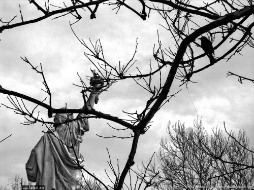
It is possible to take the city out of it’s usual used up context and put it into a different light that will either retain or enhance city’s character. Since these posts are in part shameless promotion of Safari’s art work, allow me to use one of his Cleveland images as an example.

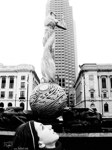
The following image is a take on a well known statue that in a way became associated with Cleveland. This symbol of the city has been, you may say, heavily abused.But this simple fresh perspective although made just for fun adds to the reality ofthe statue. It enhances the vision of this work of art and at the same time personifies it.


Behind the liberty © Anastasiy.Safari. 23x17". Photocopy.This next work is en example that is ways away from Cleveland…

This symbol of New York city is a very well known and photographed landmark. I am sure you have seen myriads of pictures that portray this symbol our great nation of United States of America. However this is a daring take on this symbol of great power. This portrayal is rather depressing and some might say relatively negative, yet it does not denigrate the symbol itself. There are no horns on writings on the statue, it is simply taken in it’s context on this grey day in March. Its surroundings enhance its meaning in this troublesome times. 

I hope to have made a sufficient amount of one sided claims here to evoke a responce and a counter argument from the audience. See farther posts that describe other reasons why people purchase art.


, | 3 comments
Ilya Gotfryd

Agent’s Bias: Digital Photography as Fine Art.

Posted by Ilya Gotfryd on Thursday Sep 4, 2008 Under Agent's bias

This might come as a surprise to some, but many casual browsers and potential buyers frown at the proposition of Digital Photography as a Fine Art. In fact I am fairly certain that some of you reading this passage find yourself in agreement with this notion.

Allow me to take a stab at this concept. I hope to see it bleed to a point that will allow you to see through the prejudice of a tool to an essence of an art work.

For this installment I would like to discuss the supposed ease of image alteration. Any owner of Cannon Digital Elf or any other point and shoot camera knows that Picasa’s “I Feel Lucky” button along with crop and sharpen features can take their digital snaps quite far along. Face recognition features in inexpensive digital cameras allow for wonderful family photos. This inevitably breeds a false perception that an observer could just as easily have taken the snapshot presented to him in a frame at a premium price.

A true craftsmen of the digital photography realm simply exchanges the red light of the dark room for the set of LED back-lights at his computer monitor. Complexity of analog photography is no longer an obstacle to achieving the final vision and style of the artist. Even though the artist can take thousands of snaps with out a penalty of forbidding costs there is still more then enough risk, chance and expertise in the photo-hunt.

Read the next post in this series to appreciate the complexity of the digital photographer’s craftsmanship.

ILYa


, | 20 comments
Ilya Gotfryd

Agent’s Bias: buying art

Posted by Ilya Gotfryd on Wednesday Sep 3, 2008 Under Agent's bias

Every honest opinion is slanted towards writer’s personal interest and sprinkled with generalities. To make this modestly entertaining I have no intention of stray from this beaten path.

I firmly believe that people should buy art. This is something that should be done regularly and that this is something that general population needs to get good at.

There seems to be no authority on taste, so it is aught to be close to impossible to determine a good art buy from an aesthetic stand point. In this series “Agent’s Bias: buying art” I am going to muse on the subject of this unknown.

ILYa


, | 1 comment